Boost Your Click-Through Rates: Techniques for Email Marketers
In email marketing, crafting messages that resonate with your audience is only the first step. The true measure of success lies not just in having your emails opened but in getting your readers to take the next step: clicking through.
Open rates might give a glimpse into how many eyes see your message, but it's the click-through rate (CTR) that reveals the effectiveness of your call to action, content relevance, and overall engagement strategy.
In this blog, we unpack all the strategies for elevating your click-through rates, from crafting irresistible CTAs to personalising your content. Let’s get those contacts engaged.
What is the click-through rate?
Your click-through rate measures the percentage of email recipients who clicked on one or more links contained within an email. It serves as a direct indicator of how well your email has encouraged recipients to take a specific action. Such actions include visiting a website, viewing a product, or revisiting a shopping cart.
The click rate also measures engagement by accounting for the total number of clicks an email receives, but it doesn't provide context for how many recipients viewed your email. The click-through rate offers a more accurate measure of engagement by comparing clicks to the number of impressions.
Click-through rate formula
The calculation for your click-through rate is straightforward, though: dividing the number of unique clicks by the number of emails delivered, then multiplying by 100 to get a percentage. But don’t worry, your email marketing automation platform will handle all the math for you.
CTR = unique clicks/number of emails delivered x 100
How to Improve Click-Through Rate
Improving your click-through rate is essential for increasing engagement and, essentially, boosting revenue. Here are our top tips for skyrocketing your CTR:
1. Segment and Personalise
Personalisation goes beyond addressing recipients by their first names. Divide your email list into segments based on specific criteria, such as demographics, purchase history, or engagement level, and use data analytics to understand what each segment finds valuable. This way, you can tailor your messaging accordingly and make your emails more relevant and engaging, increasing the likelihood of clicks.
2. Optimise Email Content
Start with a strong subject line. Subject lines are the first thing recipients see when they receive an email. They play an important role in determining whether the email will be opened, ignored, or even marked as spam. Capture attention with a subject line that addresses the recipient by name, fostering a personalised connection. This makes the email feel tailor-made and relevant to the recipient. Such personalisation holds immense potential, driving up open rates and boosting your CTR too. If you are promoting a sale, include the discount in your subject line to entice your recipient. Make sure to maximise your preview text to tease more of what’s inside your email.
Then, the body of your email should deliver on the promise made in your subject line, providing value that meets the recipient's expectations. Keep your copy concise and engaging. Most subscribers are only going to skim your emails so use visually appealing images to enhance your message. Highlight the benefits of clicking through and what the recipient will gain. You can also incorporate dynamic blocks tailored to your subscribers' preferences, purchase history, location, or gender to greatly boost your click-through rate. This personalised approach not only deepens connections but also amplifies brand engagement and conversions.
3. Don’t Overwhelm Your Email Design
After crafting your content, design your emails to be easy to navigate. Use quality images or gifs to highlight your product or value proposition. If you are sending a how-to guide or educational content, make sure the steps or process are clear, simple, and easy to understand. Don't overlook the importance of a clear menu in your email design. Whether it's positioned in the header or footer, it's crucial to include the main categories or promotions you want to highlight. While it might seem visually appealing to omit a menu entirely, it could harm your click-through rates (CTR). Ensure your audience can easily navigate your content, maximising engagement and driving desired actions.
It’s important to strategically use typography, colours, contrast, alignment, proximity, and white space to emphasise key elements like CTAs to strengthen your visual hierarchy.
Bright colours catch attention, but some combinations can be hard to read, especially for those with vision issues. Consider colour contrasts to improve readability. Here’s a simple guide to help you create a design element that's easy on the eyes.
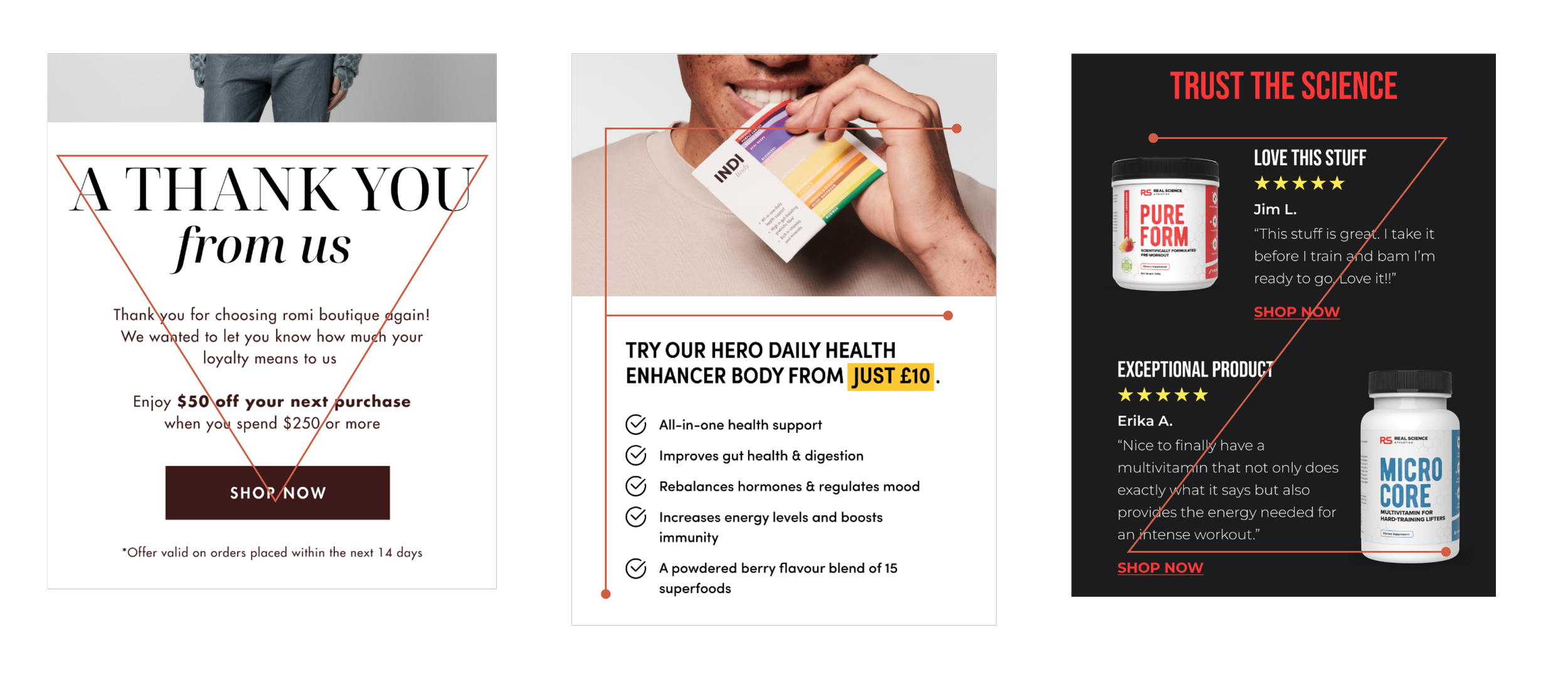
Visual Hierarchy Examples in Emails
Inverted Pyramid: The inverted pyramid method focuses attention on the most important content while minimising distractions. It makes it easy for readers to follow and encourages clicks. Text is larger in headlines and smaller in the email body, creating a clear hierarchy of importance. This design works seamlessly on both computer and mobile screens.
F Pattern: The F Pattern suggests putting important information at the top of your email and less important details on the left side. It's commonly used in single-column HTML email templates and is considered one of the best options for mobile-optimised messages.
Z Pattern: The Z Pattern, also known as ZigZag, is a highly effective visual layout in e-commerce emails. It's simple and easy for readers to follow, guiding their eye movements in a zigzag pattern. This layout helps fit lots of content into emails without looking cluttered.
4. Optimise Your Emails for Dark Mode
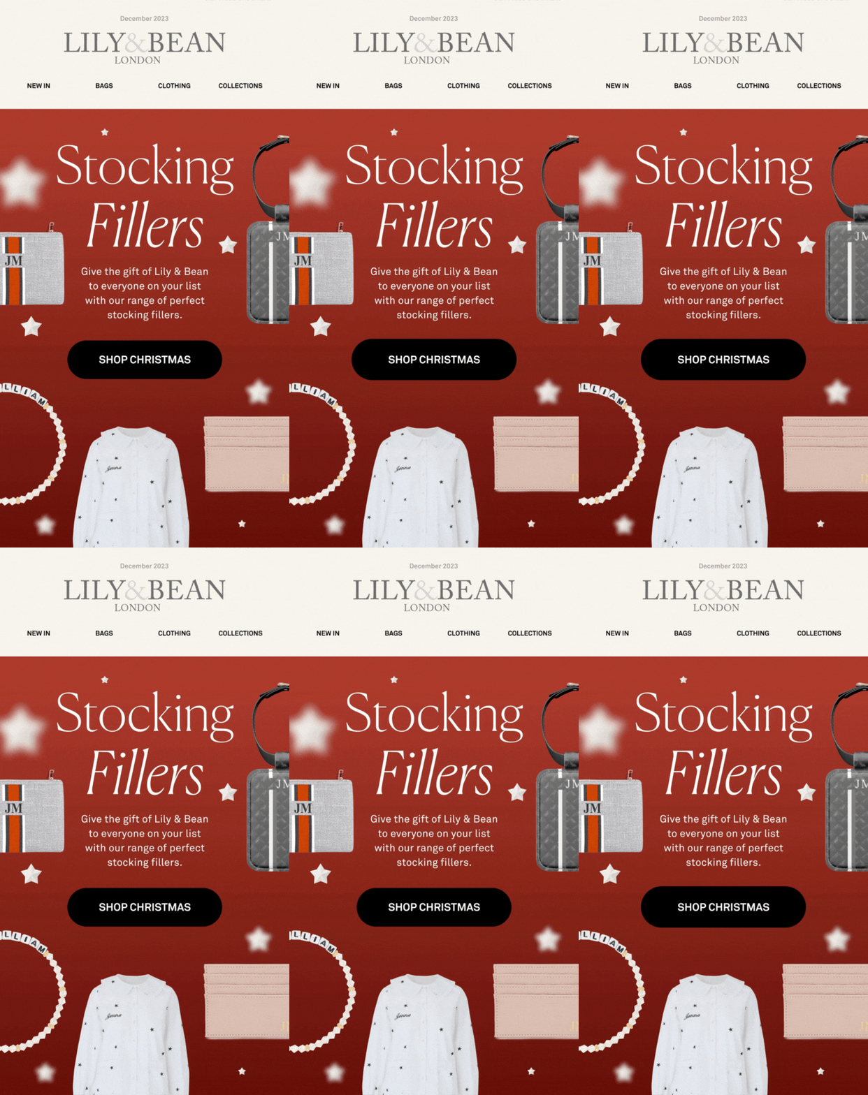
More and more shoppers are using their smartphones to access emails. It is essential to prioritise a responsive, mobile-friendly approach in your email design. Seamlessly adapting your layout to various screen sizes, dark mode preferences, and resolutions isn't just a suggestion—it's a strategic imperative for enhancing click-through rates (CTR). Remember, design elements like colours, CTA buttons, and icons may differ between dark and light modes, so ensure compatibility across both for an optimal user experience that drives engagement. Take a look at the example below from Lily & Bean, showcasing a side-by-side comparison of an email in both light mode and a custom dark mode theme.
Image source: Melusine Studio (L-R: light and dark mode email theme)
5. Offer Exclusive Content or Discounts
Provide value that makes opening and engaging with your emails worthwhile. Exclusive offers, early access to sales, informative content, or valuable resources can encourage recipients to click through to receive something they can't get elsewhere. Creating a sense of urgency, especially for time-sensitive offers, is a timeless strategy, signalling to customers that taking immediate action is undeniably in their favour.
Image source: Milled
6. Use Clear and Actionable CTAs
Your CTAs should be specific, action-oriented, and clearly state what you want the recipient to do next. Avoid using too many CTAs so as not to overwhelm and opt for buttons over links. Whether it's "Shop Now," "Learn More," or "Sign Up," your CTAs should stand out and provide a clear next step for engagement. Consider incorporating interactive elements, such as animated buttons, to keep them striking and noticeable. Check out this example created by Melusine Studio for Lily & Bean. You can be creative in crafting your CTAs as long as they’re relevant to your content; however, avoid too long and vague CTAs. Keep it as direct as possible. To learn more, read our blog article about perfecting your call-to-action.
Image source: Melusine Studio
7. Leverage Social Proof
Incorporate testimonials, reviews, or user-generated content to build trust and credibility. Seeing positive feedback from other customers can motivate recipients to click through and explore your offerings.
Source: Milled
8. Time Your Emails Strategically
The timing of your email can significantly impact its performance. Analyse the data to identify when your audience is most likely to engage with your emails. Test different sending times to find the optimal window and personalise the timings based on your recipients’ different time zones.
9. Test and Optimise
A/B testing helps you understand what lands with your audience and what doesn’t. Test different elements of your email, such as subject lines (your first impression), email copy, CTA placement, and design elements, to see what drives the highest CTR. Use these insights to refine your future campaigns.
Pro Tip: High deliverability is essential and the first important step for ensuring your emails reach the right inboxes. Pay attention to factors such as email authentication, sender reputation, and email content quality to improve your deliverability rate.
Final Thoughts
From crafting compelling subject lines to personalising content and optimising every aspect of your email design, the path to higher CTRs involves a thoughtful, data-driven approach. Remember, the goal is to deliver value that resonates with your subscribers, encouraging them to interact with your brand time and again.
If you're looking to elevate your email marketing strategy and improve your key performance metrics, we’re here to help. Get in touch today to learn more about how we can support your email marketing goals.


