Perfecting Your Call-To-Action (CTA)
In the world of email marketing, the call-to-action (CTA) button is the unsung hero. CTAs provide a sense of direction to your emails, and that direction isn't always about making a sale.
It’s no coincidence that "Shop Now" has reigned supreme in email CTAs for a number of years, but as our understanding of the intricacy of the customer journey has grown, so has our approach to CTAs.
So what makes an effective CTA? What should be avoided at all costs? And how should you go about crafting your own to drive traffic and guide your customers to the ultimate destination: conversion.
What is a CTA?
A Call-to-Action (CTA) button is a fundamental tool in email marketing. It's a clickable visual element, strategically placed to serve as a gateway to online destinations like landing pages or product pages.
CTAs, characterised by their action-oriented language, are intended to capture readers’ attention and motivate them to engage with email content. This increase in click-through rates driven by CTAs is the cornerstone of a successful email marketing strategy.
Whether the desired action is to provide feedback, consume valuable content, or make a purchase, CTAs are the catalysts that facilitate conversions.
The anatomy of a great CTA
There tends to be a common thread among successful CTAs, with active verbs and thoughtful placement scoring the highest click-through rates. But the disheartening truth is that many marketers default to their ESP settings, opting for a path of least resistance.
Here are three compelling reasons to invest time and effort into well-crafted CTAs within your marketing arsenal:
1. Clarity and Purpose
A well-designed CTA button brings clarity and purpose to the user experience. It leaves no room for confusion, guiding your customer on the next step to take. Through carefully chosen words and a compelling visual cue, you can eliminate ambiguity and direct action.
2. Transforming Readers into Participants
The CTA button serves as a catalyst, transforming passive readers into active participants or customers. Placed strategically within your email, it can propel your audience towards conversions and achieve your email goals.
3. Triggering Immediate Action
CTAs tap into psychological triggers, igniting a sense of urgency that compels users to act swiftly. The fear of missing out drives immediate action, pushing your audience to seize the opportunity before it slips away.
What not to do
When crafting your CTAs, you want to steer clear of some common pitfalls that can hinder their effectiveness. Here are some things to avoid:
Vague Language
Ambiguity is the enemy of a good CTA. Avoid vague or unclear language that doesn't specify what action you want the reader to take. Instead, be explicit and precise about the desired action.
Overdoing It
Being Too Pushy
While urgency can be effective, avoid overly aggressive language that can come across as pushy or insincere. Instead, use persuasive and respectful language.
Neglecting Mobile Optimisation
Many people read emails on mobile devices. Ensure that your CTAs are easily clickable and visible on small screens. Test your email layout on various devices to guarantee a seamless experience.
Lack of Value Proposition
Your CTA should convey the value or benefit the reader will get by taking the desired action. Avoid CTAs that don't offer a compelling reason to click.
Ignoring A/B Testing
A/B testing is essential to optimise CTAs. Neglecting this can mean missed opportunities for improvement. With Klaviyo, you can continually test different CTA elements like text, colour, size, and placement to determine what works best for your audience.
Generic Language
Generic CTAs like "Click Here" or "Submit" can be uninspiring. Use specific, action-oriented language, tailored to the content of your email.
Lengthy CTAs
Keep your CTA concise. Long, wordy CTAs can overwhelm readers. Stick to the essentials to maintain clarity and impact.
Inconsistent Branding
Ensure that your CTAs are consistent with your brand's voice, style, and design. Inconsistent CTAs can create confusion and reduce trust.
Ignoring Analytics
Neglecting to track your CTAs means you miss out on valuable data. With Klaviyo, you can analyse click-through-rates and conversions to find out just what works best for your audience.
Crafting Modern CTAs
Now that we've established the vital role of CTAs, it's time to move beyond the "Shop Now" cliché and explore modern, engaging alternatives. Here's are some of our favourites to inspire your next email campaign:
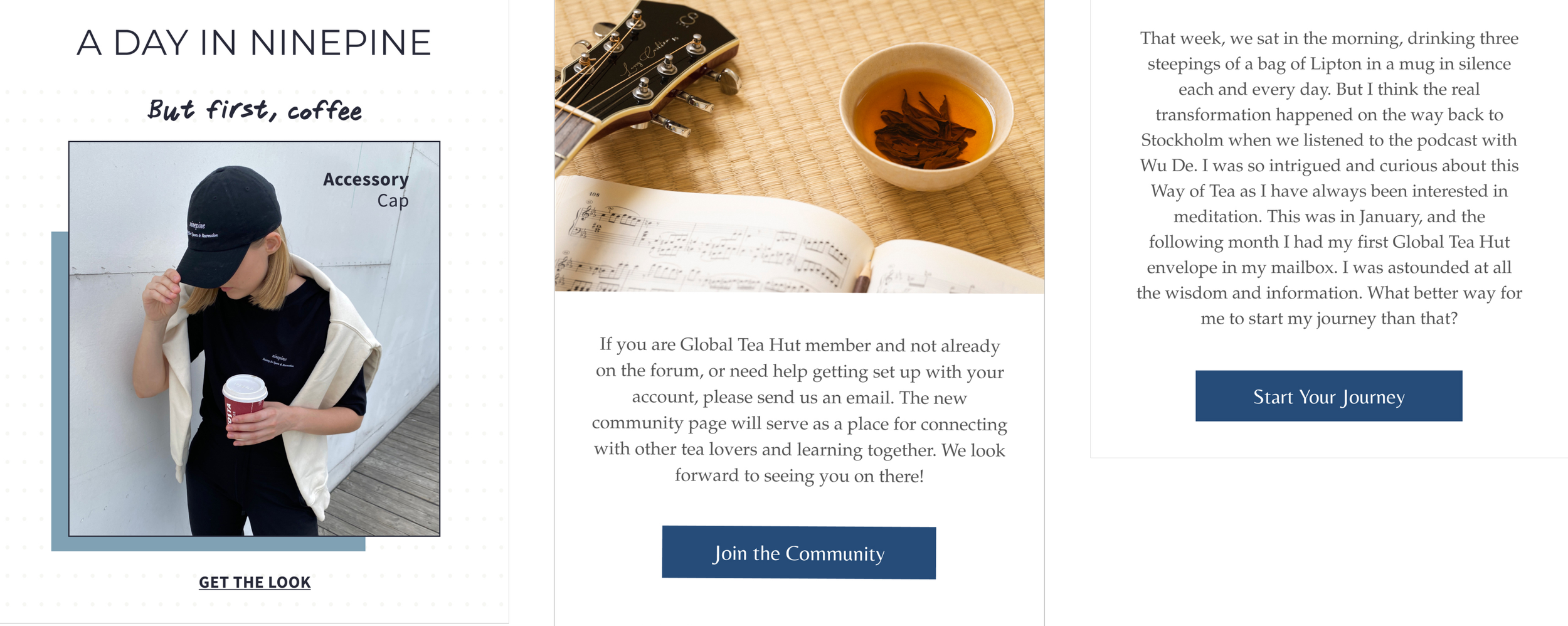
1. "Get The Look"
In fashion e-commerce, your email imagery is all about selling an achievable style to your consumers. Encourage engagement with an invitation to make your looks their own.
2. "Join the Community"
Foster a sense of belonging by inviting subscribers to join your online community. This CTA not only drives action but also cultivates brand loyalty.
3. "Unlock Exclusive Access"
Create a sense of exclusivity by offering special access to your email recipients. This CTA uses the allure of exclusivity to drive clicks and conversions.
4. "Start Your Journey"
For products or services that offer a transformative experience, this CTA beckons users to embark on their journey with your brand.
5. "Get Inspired"
Appeal to the creative side of your audience by encouraging them to seek inspiration from your content or products. This CTA sparks curiosity and engagement.
Final Thoughts
CTAs are the beating heart of your email campaigns. While "Shop Now" still has its place, embracing modern CTAs will breathe new life into your marketing efforts. By following the principles of clarity, transformation, and urgency, your CTAs can elevate your email marketing game and drive the results you desire. So, don't be afraid to get creative with your CTAs—these buttons have the power to inspire action and propel your emails to new heights.


